Sono Coffee Branding

Sono Coffee came to me to brand their new coffee business. Sono means “I am” in Italian and the name was chosen to remind their customers that coffee is such an important part of all of our “I am” moments. My client explained the story behind the coffee this way, “…it’s all about really good coffee that is a part of so many of our communal events. When you were here in CO visiting, we went for coffee together. I’ve never, ever, had a writing or recording session that didn’t involve (usually a lot of) coffee. And I can’t sit down for any meaningful quiet time, either with God or my own thoughts, without a cup of coffee.”

After research and much creative thought and exploration and how to represent their story, I came up with branding that uses quotation marks and drops to represent coffee and conversation. This logo visually represents that story of coffee being a necessary component of conversation whether it be personal, professional, or spiritual.

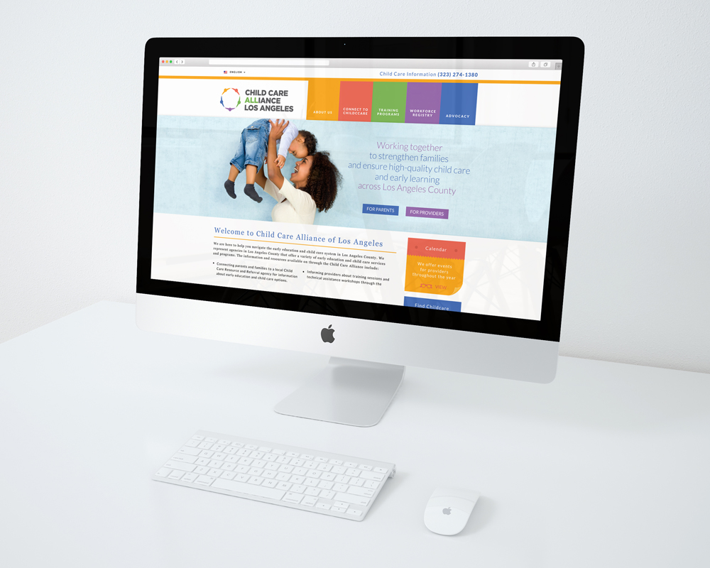
WEBSITE DESIGN LAYOUT FOR ZBRA STUDIOS

Website design layouts for a Zbra Studios client. I created the page designs. Upon the client’s approval, Zbra Studios developed the site. You can check out the final site here.

Misc Logo Comps

For one reason or another these logo ideas didn’t get a green light.

Word Entertainment CD Cover


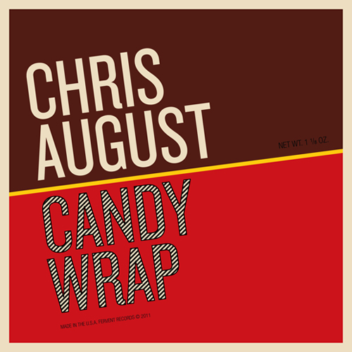
For this single titled, “Candy Wrap”, I wanted to capture the look of an traditional chocolate bar.  My constraint was that I had to use Chris August’s current branding which dictated the font choice. I think it turned out looking rich and chocolatey.

chocolatebars

SESAC Award Dinner Invitation

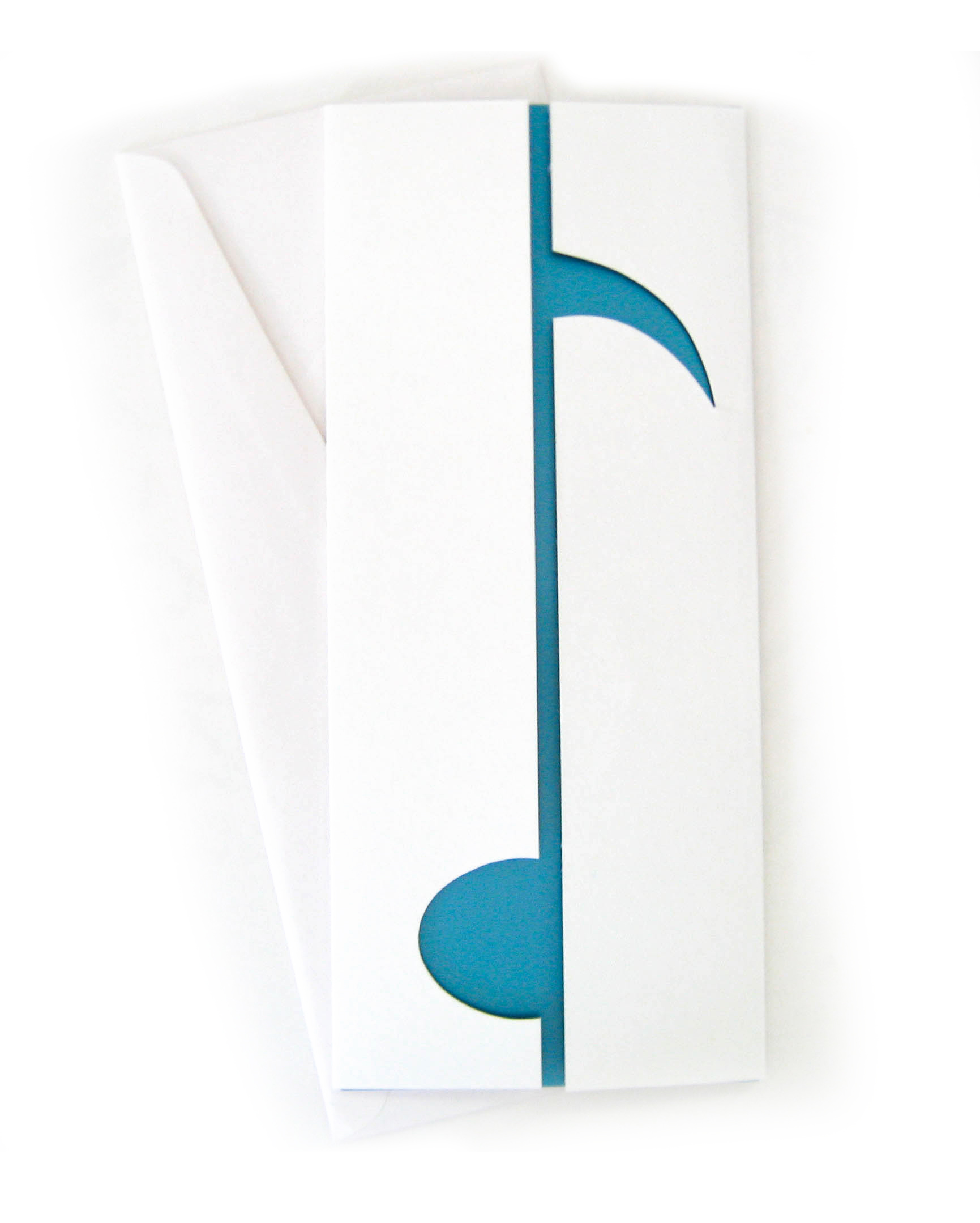
The first invitation was designed for a dinner in honor of SESAC’s Television and Film Composer winners. I created the negative space/diecut of the invitation’s cover to reflect the idea behind the SESAC award’s negative space that creates a musical note. The cover was not printed on and the interior was printed in two colors: blue metallic and black.

SESAC_Award