Book Series for Restore Ministries

In 2006, Scott Real wrote his first book, Journey to Freedom. This book became the cornerstone for Restore Ministries’ small groups. In 2007, the other four books – Journey to a Life of Significance, Journey to Living with Courage, Journey to Healthy Living, and Journey to a New Beginning after a Loss – were published. The design of the additional four books took on the look of the first book. However, the original design format did not accommodate the lengthier titles so the overall design suffered—making the additional books look like they were designed as afterthoughts.

My approach was to create a format that could accommodate the book titles whether they were long or short. I wanted each book to look like it belonged in the series, yet be easily distinguishable one from another which I accomplished with different color palettes.

2020 Self Promo

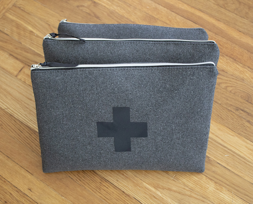
The beginning of 2020 started off slow, so I decided I should use the time to create a self-promotional piece. I wanted the piece to be something that would remain on the potential client’s desk, not just be tossed in the trash. Since it was winter, I decided to create “winter survival kit” with items that they could keep at their desk to use as needed.

I started with felt bags that I found at Target. I replaced the pomp pomp on the zipper with black ribbon and added a first aid cross. I decided to add these items to each kit:

    • For fast relief when someone calls in sick — Elka Seltzer
    • When work is keeping you from taking lunch — granola bar
    • When your to do list gets too long — To Do List pad
    • When your work load is driving you to tears — tissue
    • When you need an extra hand — mittens
    • When you have an emergency — EmergenC
    • When you’ve had to bite your lip through a meeting — Chapstick

This was a fun project to imagine and execute.

Book Interior for Dexterity

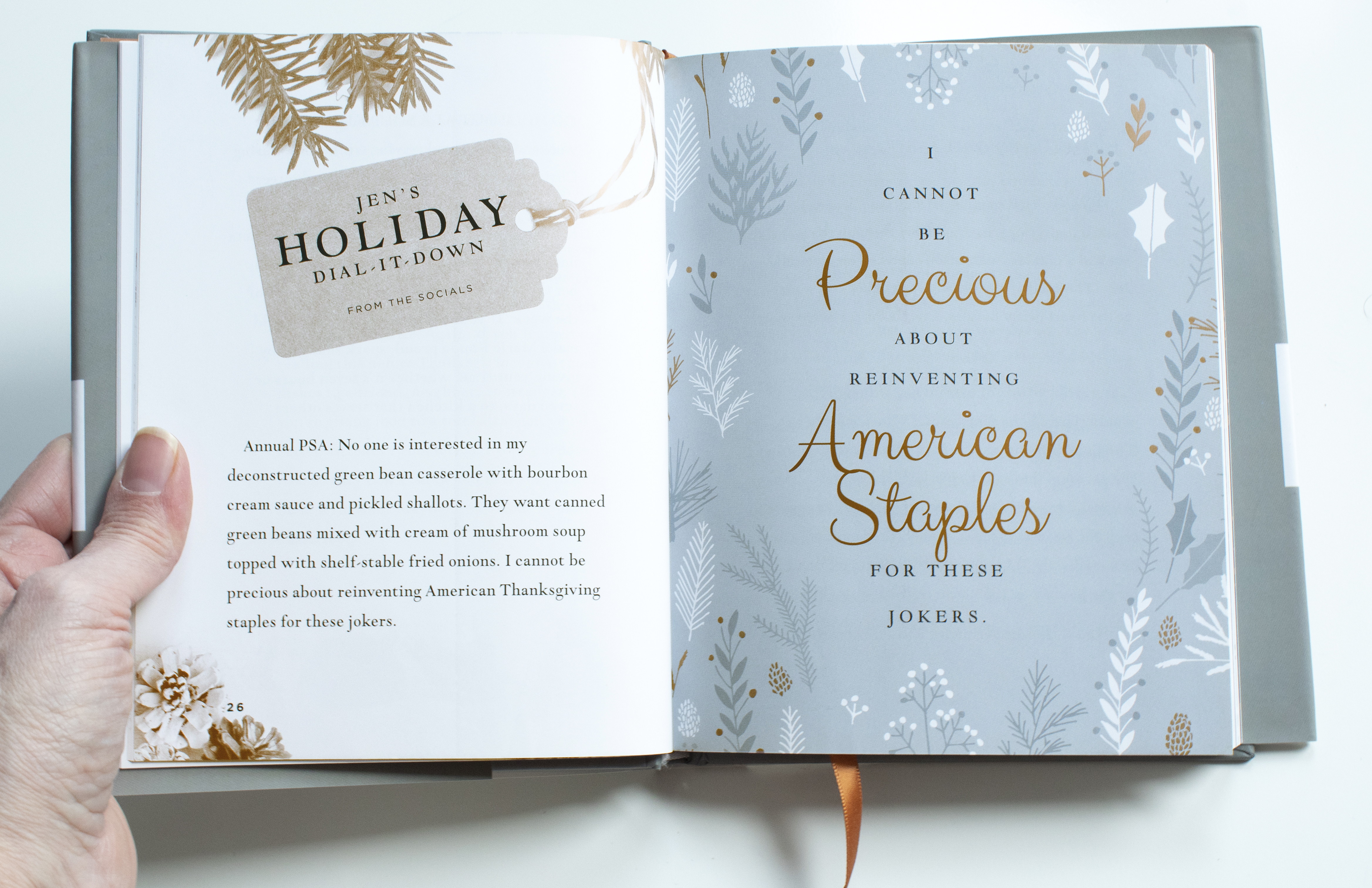
I was hired to create the interior layout for Jen Hatmaker’s book, 7 Days of Christmas. The cover had previously been designed by another designer and approved. My job was to create an interior that looked rich and elegant using only two colors.

Two color layouts present several challenges. For this project, one color needed to be dark enough so that the type is strong and easy to read. The other color needed to contrast the deep one and allow the artwork to look its best. And the colors needed to harmonize with the existing cover. The two colors the client and I decided on were navy and metallic copper. The navy is strong for the type and when screened back has a light blue-gray look to it which almost gives us the look of a third color. The book also contains copper end sheets and ribbon.

Each chapter header page contains negative space art and a scripture verse. Each chapter has a spread entitled, “Jen’s Dial it Down” that the author pulled from her social media posts. The last page of each chapter contains a special quote from the author.

Strategic Future Website

Brian Wade needed a website to represent his new leadership company—Strategic Future. With this site, I broke up the content into easily digestible chunks. I also used photos throughout to help a reader easily visualize the different aspects of leadership that Brian can speak on. strategicfuture.org

Leslie A. Butler Website

This WordPress website was created for Leslie A. Butler who is a career coach. Her site offers membership package options for information and coaching to help you find your best career. The website can be viewed here.

Kombucha Bottle Labels

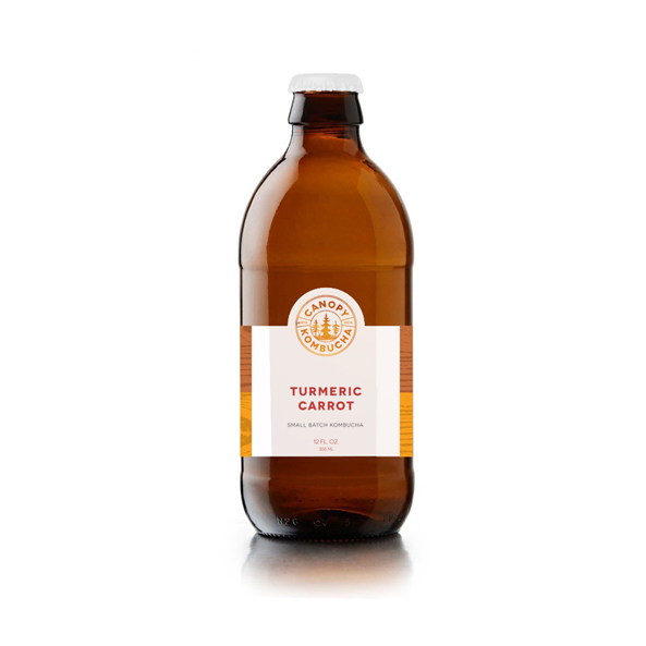
Branding for Canopy Kombucha, a small batch probiotic tea brewing company. Each of the flavors (Tumeric Carrot, Honeydew Lime, Solitude, Beet Ginger, and Cucumber Lemon) has a unique colored logo and bottle label.

Kombucha Logo

Branding for Canopy Kombucha, a small batch probiotic tea brewing company. Each of the flavors has a unique colored logo and bottle label. Cucumber Lemon, Tumeric Carrot, Solitude, Honeydew Lime, and Beet Ginger.