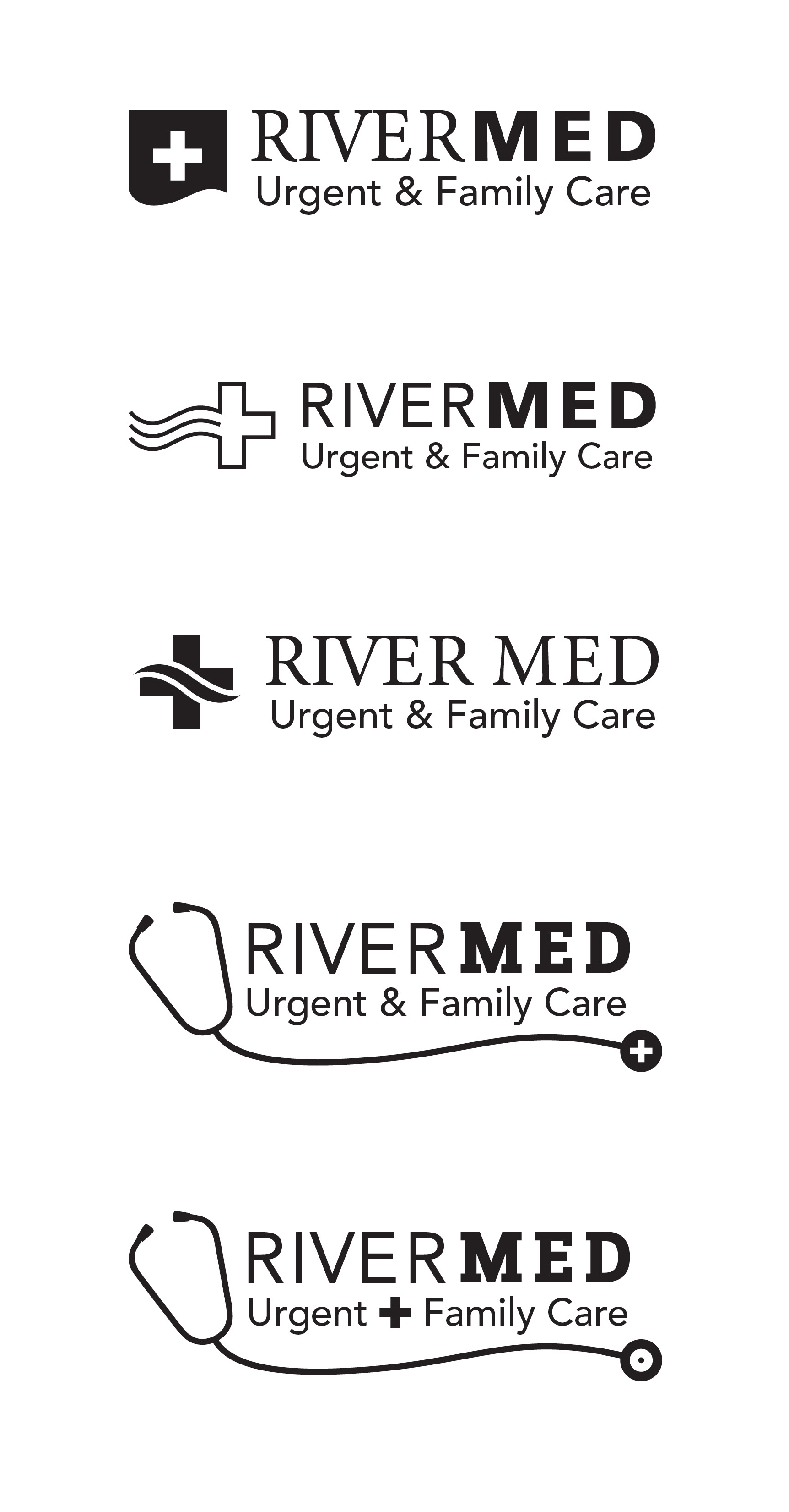
I worked with a agency who had a client that needed logo comps for a new urgent care clinic, named “RiverMed.” It was a challenge to combine two elements that didn’t seem to have much relationship: a river and medical care. To represent a river (water), I used a wavy line and to represent medical, I used the cross symbol that has stood for emergency care and first aid since the mid-1800’s. The last two comps have a more subtle reference to water because the shape of the wave is created by the stethoscope’s cord.
Before the client had the opportunity to view these comps, their legal team informed us that they could not use the name “RiverMed”. Thus began another process to come up with a new name for their business.

